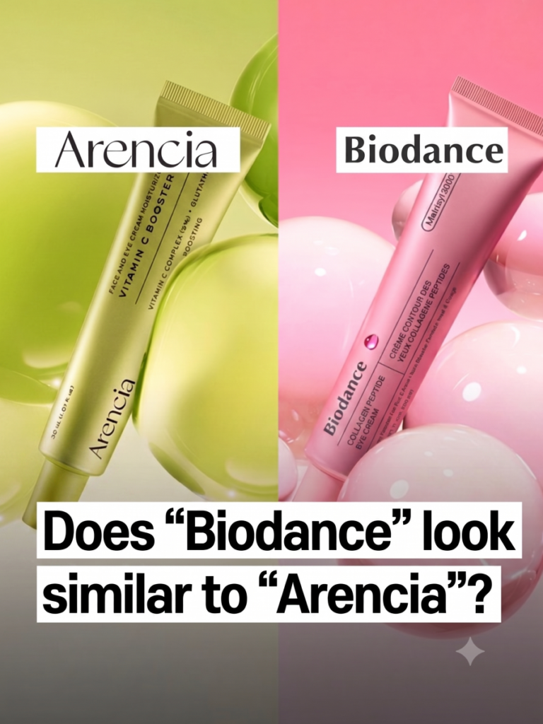
A claim is going around that a Biodance product looks a little too much like one from Arencia. Specifically, people are pointing at Biodance’s eye cream and Arencia’s Booster Shot and saying the overall impression of the packaging feels awfully familiar.
The twist that really got people talking? Biodance’s product campaign reportedly features the same model Arencia used.
Let’s walk through what’s actually being said, keep it fair to both sides, and then hand the mic to you in the comments.
Quick Answer: What Is the Arencia and Biodance Controversy?
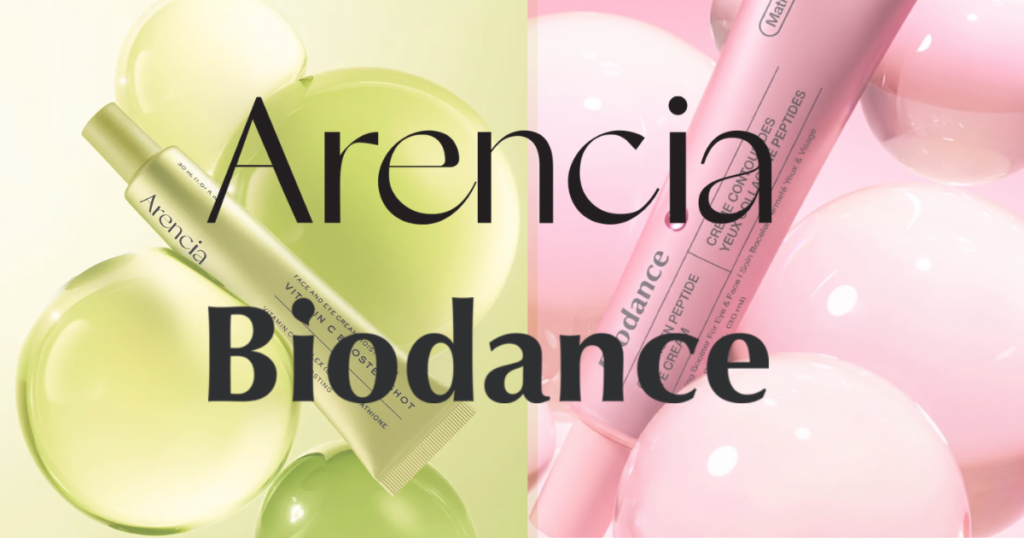
Put the two tubes next to each other and you’ll see why people did a double-take. Critics say Arencia’s Booster Shot and Biodance’s Collagen Peptide Eye Cream share a similar bottle shape and a similar overall look.
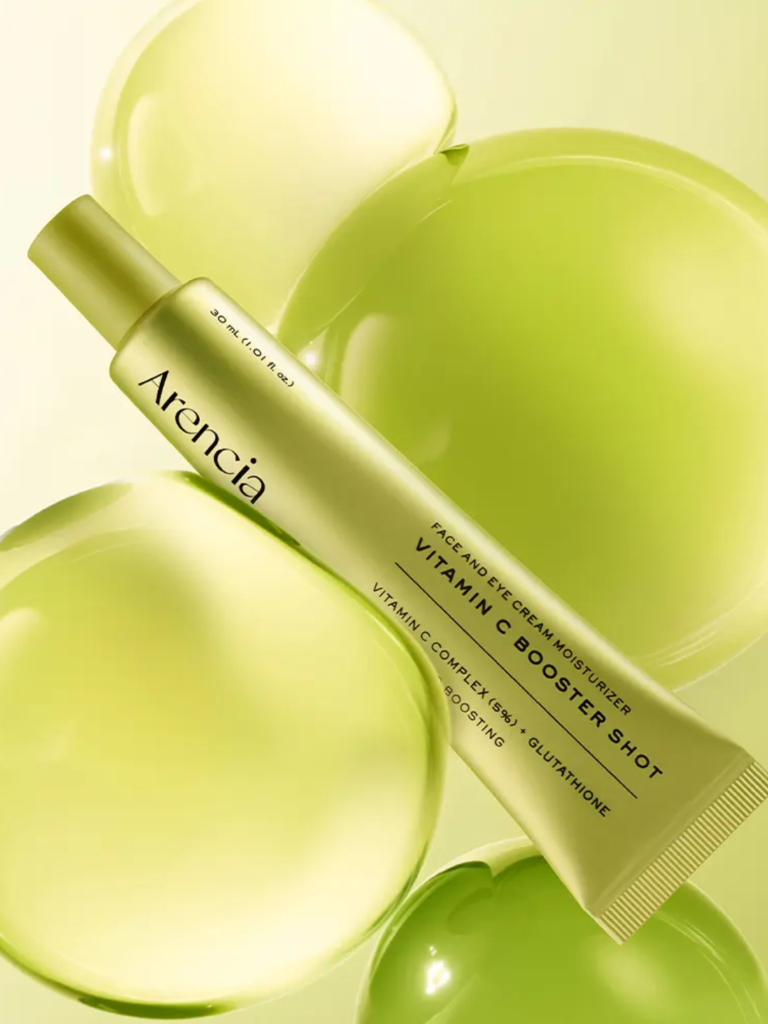
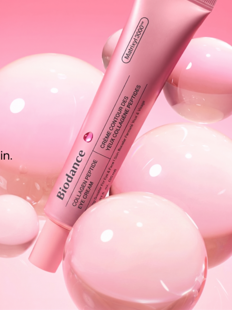
According to Arencia, the resemblance isn’t just one thing. It’s several things stacking up at once: the container shape, the color, the saturation, the surface finish, and even the placement of the text on the tube.
The Part That Really Raised Eyebrows: the Model
Packaging similarities happen all the time in beauty. But this is the detail that pushed the conversation further. The claim that Biodance’s campaign used the same model who appeared in Arencia’s ads.
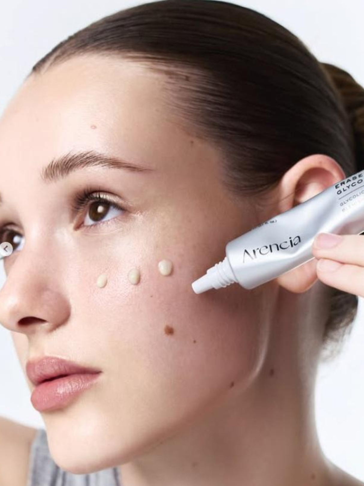
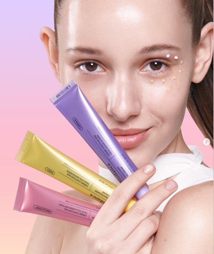
For a lot of people, packaging plus the same face in the ads is what turned “huh, that’s similar” into an actual talking point.
What Arencia Is Saying
Arencia’s deputy CEO addressed it publicly on his Threads, saying the brand had received tips that a Biodance product looked similar to their own.
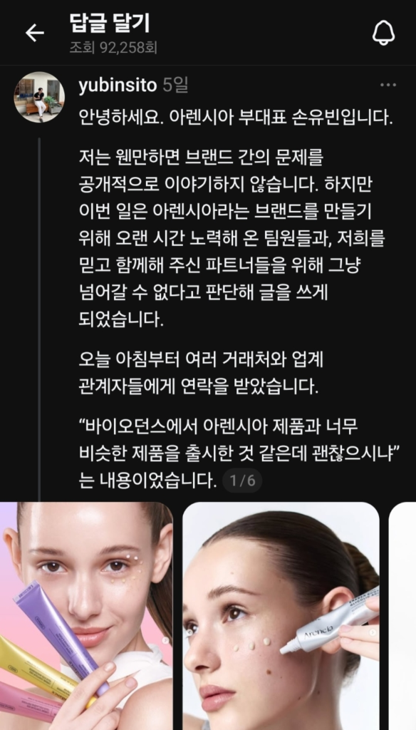
Arencia’s deputy CEO on his Threads (Korean)
Their framing was measured. In their words, “there’s no absolute standard for judging similarity,” but they argued that multiple elements overlap at the same time; the container shape, color, saturation, finish, text layout, the overall impression of the product, and content using the same model.
Arencia also made a broader point about the industry: “If we don’t respect K-beauty’s creative work and brand assets, healthy competition and creativity across the whole beauty industry inevitably suffer.”
Has Biodance Responded?
Biodance’s current official response is that the brand is “reviewing the matter internally.” As of now, there has been no separate official statement from Biodance.

Worth keeping in mind: an “internal review” isn’t an admission of anything. It’s fair to let both sides be heard before drawing conclusions and packaging resemblance, as Arencia itself acknowledged, is genuinely hard to judge objectively.
Why This Kind of Thing Matters in K-Beauty
K-beauty changes very quickly. Trends, product types, and packaging designs are updated all the time. Because of this, it is not always easy to clearly separate what is simply “inspired by a trend” from what feels “too similar.” Right now, minimalist tubes, soft gradient colors, and clean typography are very common in the market, so some similarities between products are almost unavoidable.
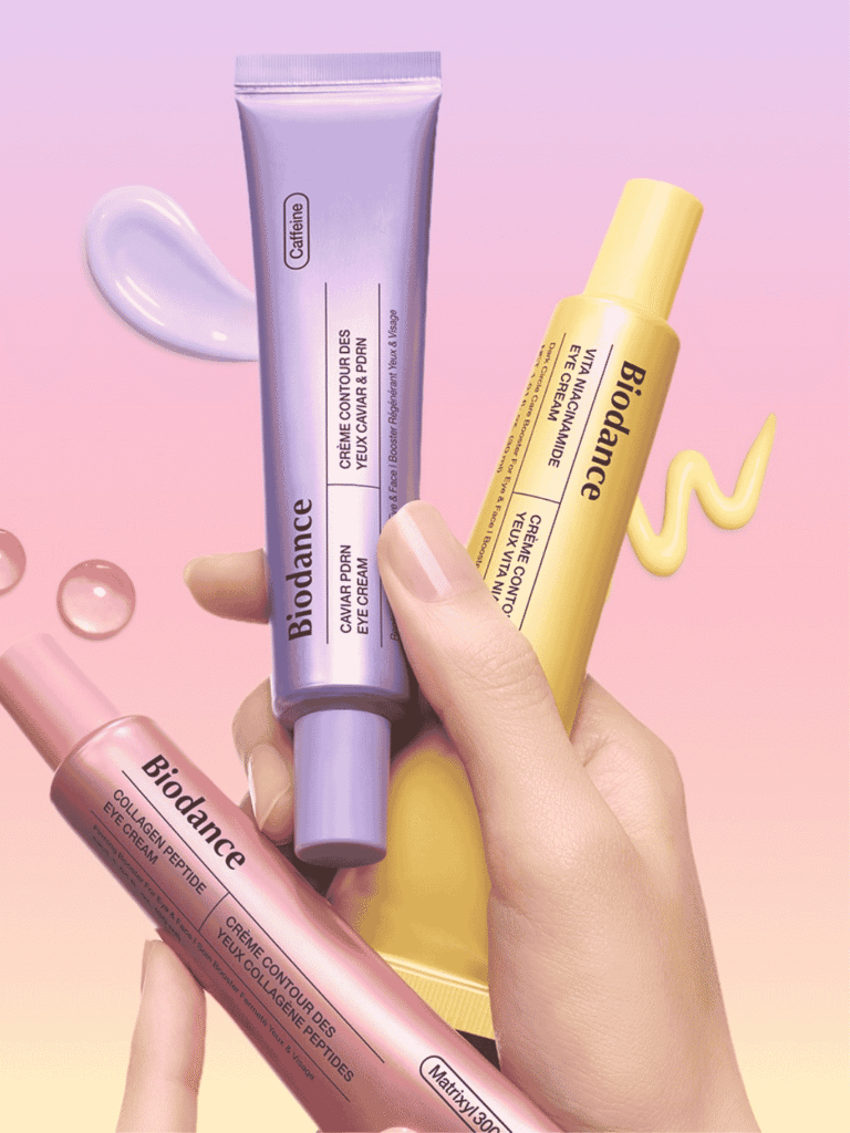
But the reason a story like this strikes a nerve is that packaging and campaign imagery are a big part of a brand’s identity, especially for indie labels competing for attention on the same Olive Young shelf. When several elements line up at once, people notice.
Over to You
This is one of those debates where reasonable people land in totally different places and we want to hear from you.
Do you think this crosses a line, or is it just two brands riding the same design trend? Does using the same model change how you read it? And as a shopper, would any of this actually affect what you buy?
Drop your take in the comments. We read every one. 👇
Related Reading
- Arencia Brand Review
- Beta-Glucan Skincare Guide
- Off Beauty: Korea’s K-Beauty Outlet (Up to 90% Off)
- MUSINSA Beauty Guide: Korea’s Indie K-Beauty Platform
- More K-Beauty Trends from Yogi Korea
This article summarizes publicly visible brand claims, product images, and campaign similarities. It does not make a legal judgment about copying or infringement, and it will be updated if either brand releases a clearer official statement.